The problem
Colors were hard to choose
What we did
Three levels of design values
Why it helps
Easier to match each value to its purpose
 Gaga
As we added new AI features, our design system stopped keeping up. Version 2.0 gave the team one clear, shared way to design across light mode, dark mode and new features.
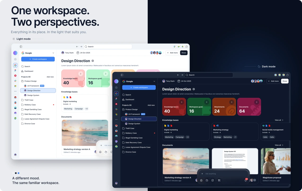
This was a team project. I helped organize the design values and component structure, and worked on reusable components and patterns for AI features.
As the product grew, the same patterns started to look and behave differently. Picking the right color was hard, the system had no light and dark modes, and special features kept adding their own rules. We needed one shared set of rules that could handle these differences.
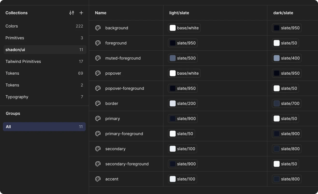
Designers needed a shared starting point for common decisions, with enough flexibility for new features. Users should get familiar controls and clear feedback everywhere, in both light and dark mode.
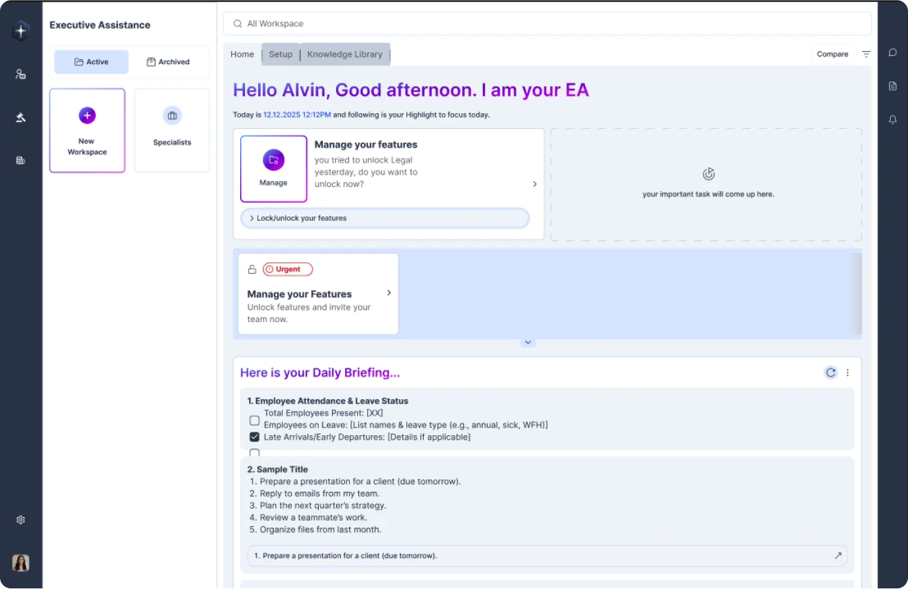
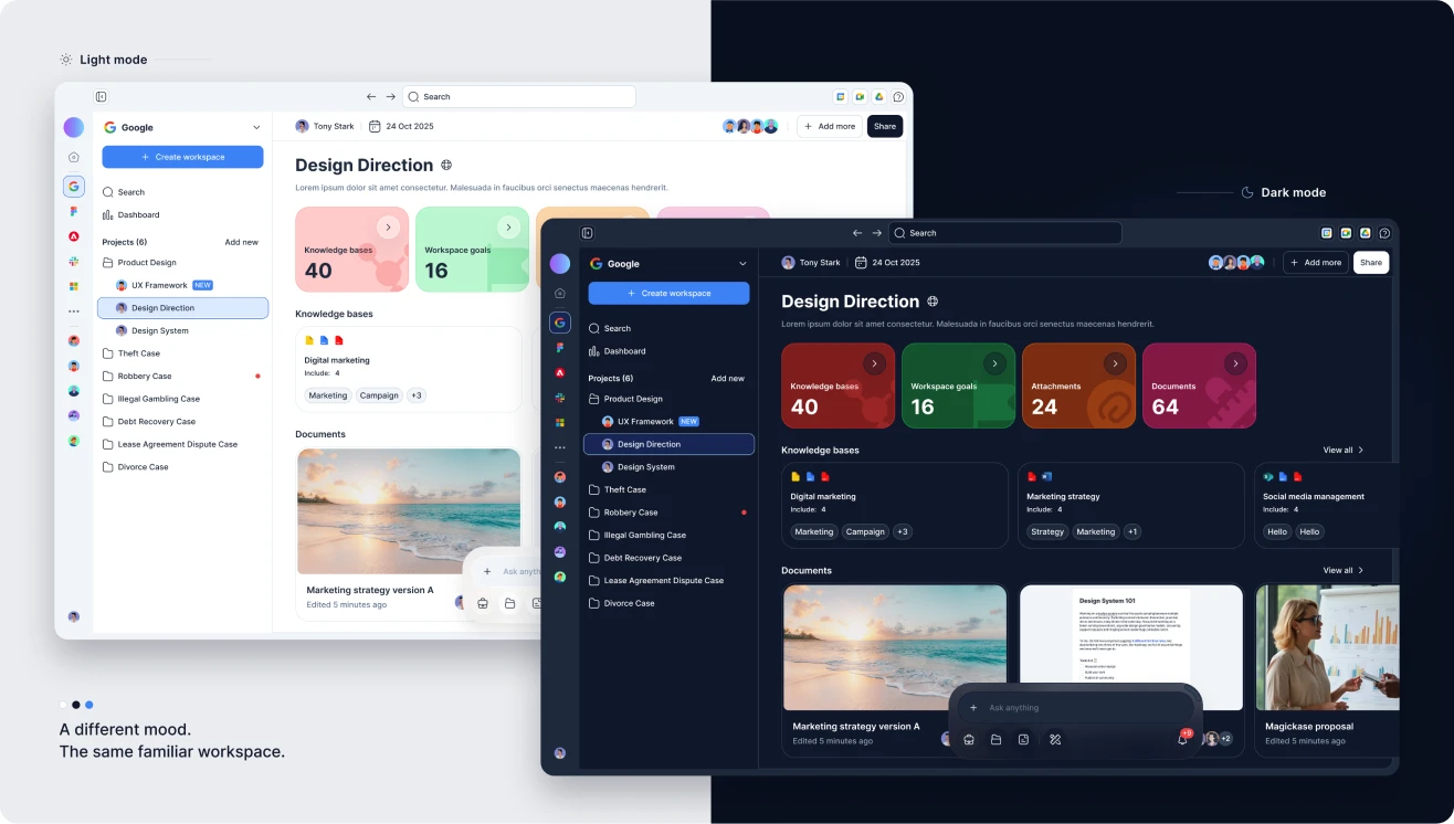
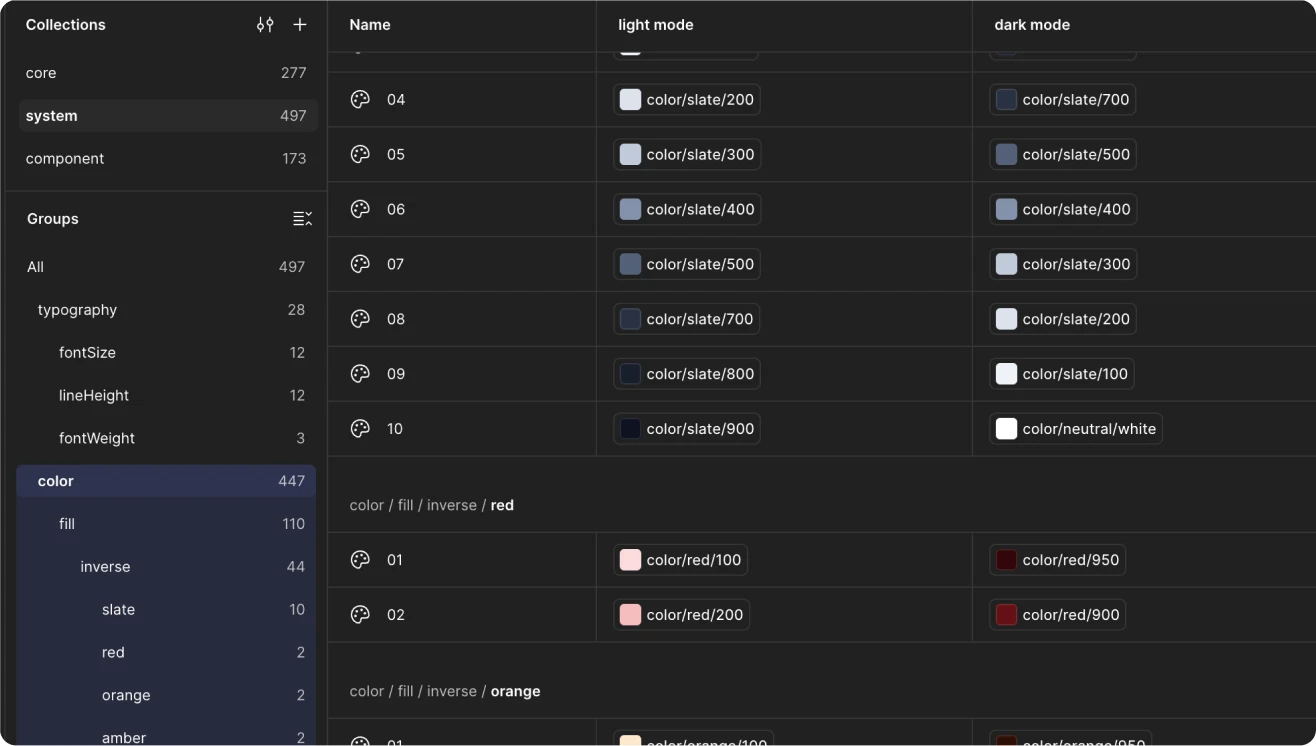
We organized design values into three levels. Core holds the basics, such as colors and spacing. System gives them a purpose, including light and dark mode. Component applies them to specific elements and states. This gave common decisions one place to live.
Version 2.0 supports both modes. The aim was to keep backgrounds, text, controls and feedback working together in the same way in either one. Accessibility still needs to be checked separately.
Buttons now come in eight types and three sizes, with four interaction states. Inputs cover thirteen types, including error messages and states such as hovered, focused and disabled. Designers can see what should happen before, during and after each interaction.
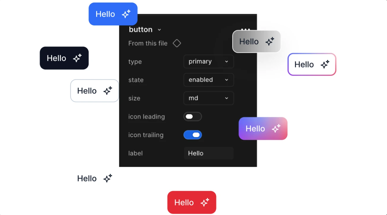
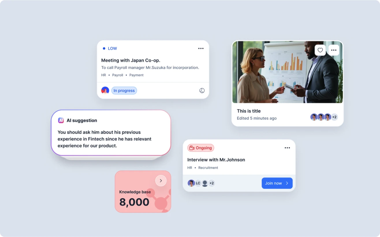
I helped organize the library from simple controls up to complete feature patterns. Flexible slots let special features add their own content while staying consistent. I also worked on AI actions, suggestions, chat inputs and attachments.
The problem
Colors were hard to choose
What we did
Three levels of design values
Why it helps
Easier to match each value to its purpose
The problem
No light and dark modes
What we did
Added both modes
Why it helps
The same roles work in both modes
The problem
Special rules kept growing
What we did
Shared patterns with flexible slots
Why it helps
Flexibility on a shared base
The problem
Default states were not enough
What we did
Clear interaction states
Why it helps
Predictable feedback across features
| The problem | What we did | Why it helps |
|---|---|---|
| Colors were hard to choose | Three levels of design values | Easier to match each value to its purpose |
| No light and dark modes | Added both modes | The same roles work in both modes |
| Special rules kept growing | Shared patterns with flexible slots | Flexibility on a shared base |
| Default states were not enough | Clear interaction states | Predictable feedback across features |
Together, we delivered three levels of design values, light and dark modes, shared typography and spacing, reusable components with clear states, and patterns for AI and special features.
A component must be flexible enough for real work without turning into many overlapping versions. We used shared foundations, clear states and flexible slots, and added variations only where needed. A next review should check which differences are really needed.
The team now has a shared reference for common design decisions. We confirmed that the system supports light mode, dark mode and new features. We have not measured delivery speed, reuse or team adoption, so I do not claim improvements there.
3 levels
of design values
2 modes
light and dark
Not yet
measured: speed, reuse and adoption
Consistency depends on deciding what should be shared and where flexibility is needed. Next, I would clarify how to use the system, review overlapping variations and test it on more real features, using feedback from designers and developers.
