
Hiring, with community.
Two connected hiring apps, with a community experience designed around shared interests.
My scope and constraints
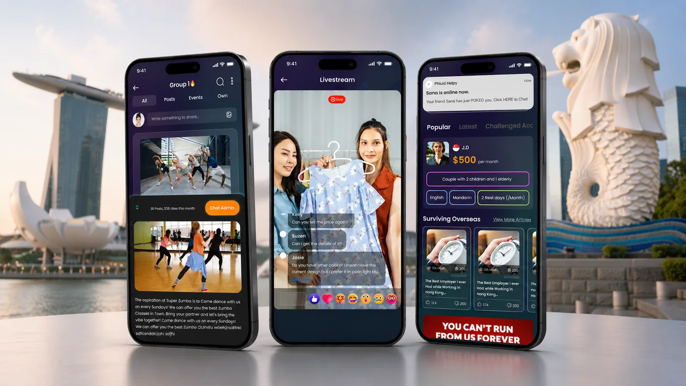
My work covered UX/UI design and testing for the connected apps and their supporting tools. Market and competitor research informed the early structure. I mapped different roles and designed profiles, communication, and community experiences, with feedback and fixes carried into successive sprints.
Hiring begins with uncertainty
The project was framed around agency-dependent hiring, limited information about potential employers, and the need for trust between both sides. Helpy serves helpers; Hire Helpy serves employers. The experience brings profiles and direct communication into two connected apps.
What success needed to look like
Support two connected needs: helping helpers and employers understand potential matches, and giving workers a place to connect through shared interests. I treated joining the platform, participating in groups, and returning to use it as different parts of the experience.
Understand the market before mapping the product
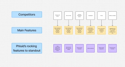
I began with market and competitor research to understand the existing landscape and identify gaps. That work informed early requirements, product structure, and user flows. I then mapped the helper, employer, and supporting operational journeys to make the relationships between the apps explicit.
Make relevant information visible before contact
Helper profiles bring together skills, experience, and work-permit status information. On the employer side, candidate discovery supports reviewing relevant information before reaching out. Direct chat gives both sides a way to ask questions and begin building trust. The design presents this information alongside skills and experience to support the decision to connect.
Create a reason to participate beyond hiring
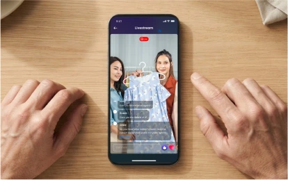
A job search is an occasional need. I also designed hobby groups around interests such as Zumba, cooking, prayer, and karaoke. These groups give workers places to connect around shared interests. Live and reward features extend the participation model, alongside the interest-based groups.
Support the people operating the platform
The experience extends beyond the two apps. Admins need role-based access to profiles, campaigns, and other platform functions, while vendor partners need their own tools. Mapping these roles helped define how the wider service supports the customer-facing experience.
Connecting needs to decisions
- User need
- Understand a potential match
- Design response
- Profiles and direct communication
- Evidence / outcome
- Profiles, status information, and direct chat
- User need
- Connect through shared interests
- Design response
- Hobby groups
- Evidence / outcome
- Group engagement was measured; values pending
- User need
- Join and return to the platform
- Design response
- Signup and recurring-use journeys
- Evidence / outcome
- Signup rate and daily engagement measured
| User need | Design response | Evidence / outcome |
|---|---|---|
| Understand a potential match | Profiles and direct communication | Profiles, status information, and direct chat |
| Connect through shared interests | Hobby groups | Group engagement was measured; values pending |
| Join and return to the platform | Signup and recurring-use journeys | Signup rate and daily engagement measured |
The tradeoff behind the design
Hiring and community do not have the same rhythm. Profiles and direct communication support a specific decision; hobby groups support participation around shared interests. I designed both within the platform, but their outcomes need to be evaluated separately. Daily activity alone cannot establish the value of a particular feature.
Use feedback to guide the next sprint
The team collected feedback and introduced fixes and improvements across sprints. My role included testing. This made iteration part of the delivery process rather than a separate activity after launch.
Separate joining, participating, and returning
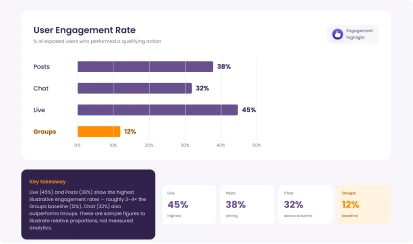
We measured signup rate, engagement with group features, and daily user engagement. These measures address different questions: can people join, do they participate in groups, and do they use the product day to day? The measurement matrix below separates these three areas; quantitative results are pending.
How I read the results
We measured signup rate, engagement with group features, and daily user engagement. A completed signup indicates entry into the platform. A group view indicates consumption; a post, comment, or response indicates contribution. Separating these behaviors makes it easier to see where users find value and where participation breaks down.
Results and measurement
- Measure
- Signup rate
- Comparison
- First launch vs after 6 months of product launch
- Before → after
- 35% increase
- Measure
- Successful employment rate through the app
- Comparison
- First launch vs after 6 months of product launch
- Before → after
- 20% increase
- Measure
- Daily active user engagement
- Comparison
- Unique users doing job search, chat, post upvote, downvote per day after 6 months of product launch
- Before → after
- 40% increase
| Measure | Comparison | Before → after |
|---|---|---|
| Signup rate | First launch vs after 6 months of product launch | 35% increase |
| Successful employment rate through the app | First launch vs after 6 months of product launch | 20% increase |
| Daily active user engagement | Unique users doing job search, chat, post upvote, downvote per day after 6 months of product launch | 40% increase |
Participation needs a clear definition
A group view and a contribution describe different kinds of value. The next analysis should distinguish reading from posting or responding, and examine whether first-time group participants return. This would help separate feature discovery from sustained community participation.
