
Website revamp for better engagement
MEB was a working design, but our client said it looks kinda boring and something is wrong; the website portal is getting traffic, but not getting sales. Here is how a focused redesign changed that, without rebuilding the product.
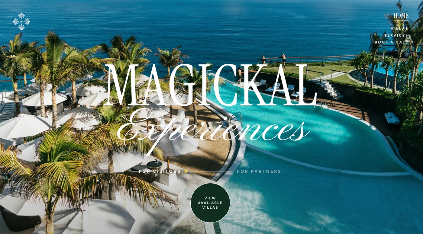
A design that worked, but did not get expected booking rates
MEB was first iterated design. The client agreed on it but then later, came back to us during beta phase, asking to check if there is something wrong.
“Uhmm, yeah, it’s good”
When we tested out with targeted group, who used to use platforms like trip.com, booking.com and other services to book, their reactions were polite, but they were not excited. I kept hearing a lukewarm “yeah, it’s good”, and those conversations did not turn into projects. For the business, that meant real opportunities were slipping away.
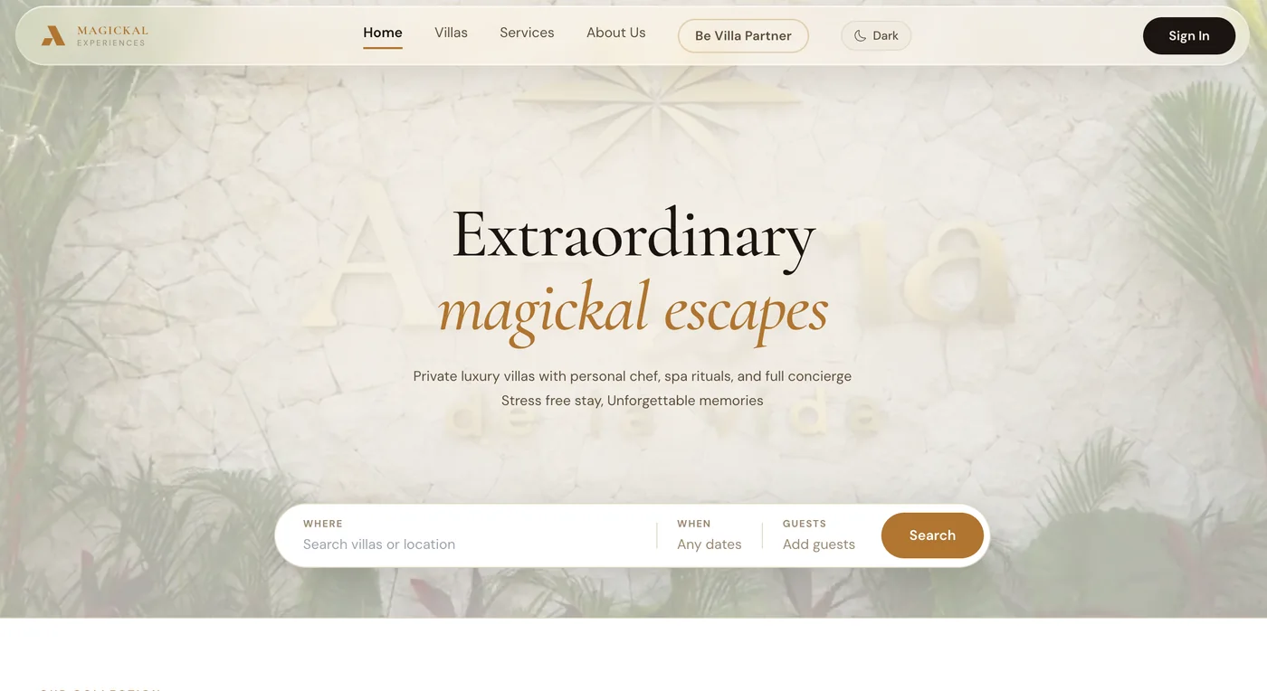
Change the design, not the logic
I raised this with our technical leadership and we discussed what to do. We agreed on a Version 2 with visible design changes, while keeping the same product logic underneath. That meant we did not have to change our architecture.
Major change (1)
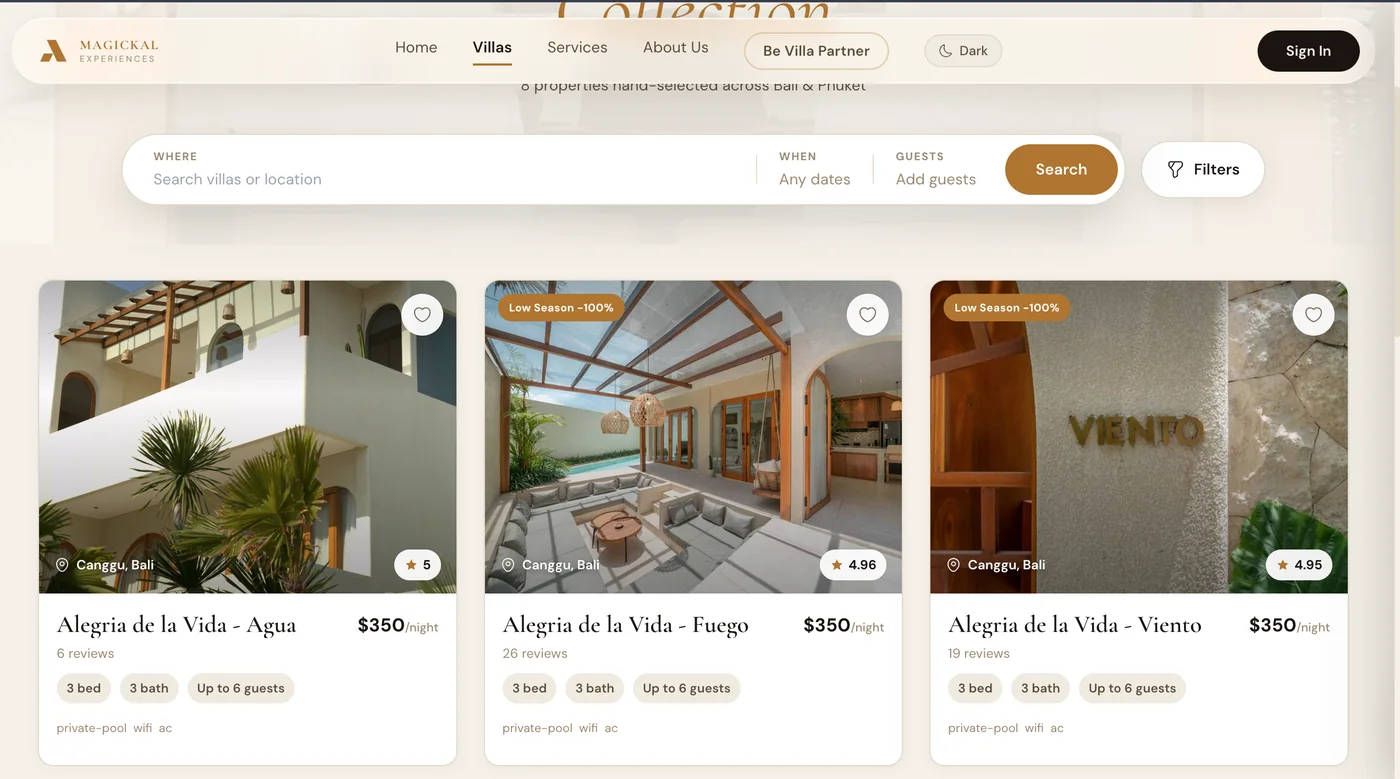
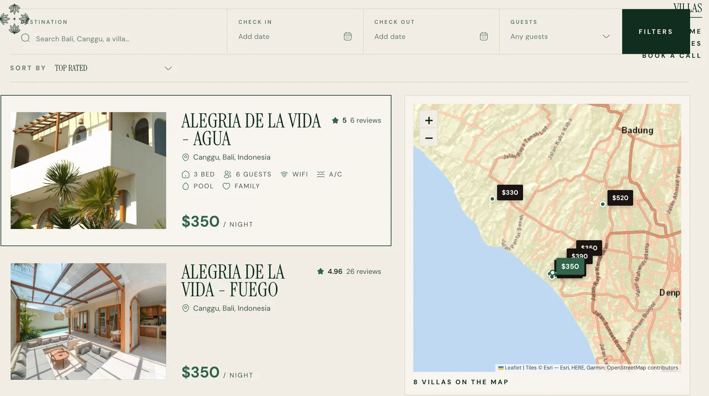
Major change (2)
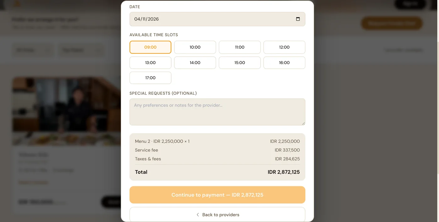
- confusing UX for users whether this would automatically lead to payment deduction.
- popup disappears after accidental clicking outside.
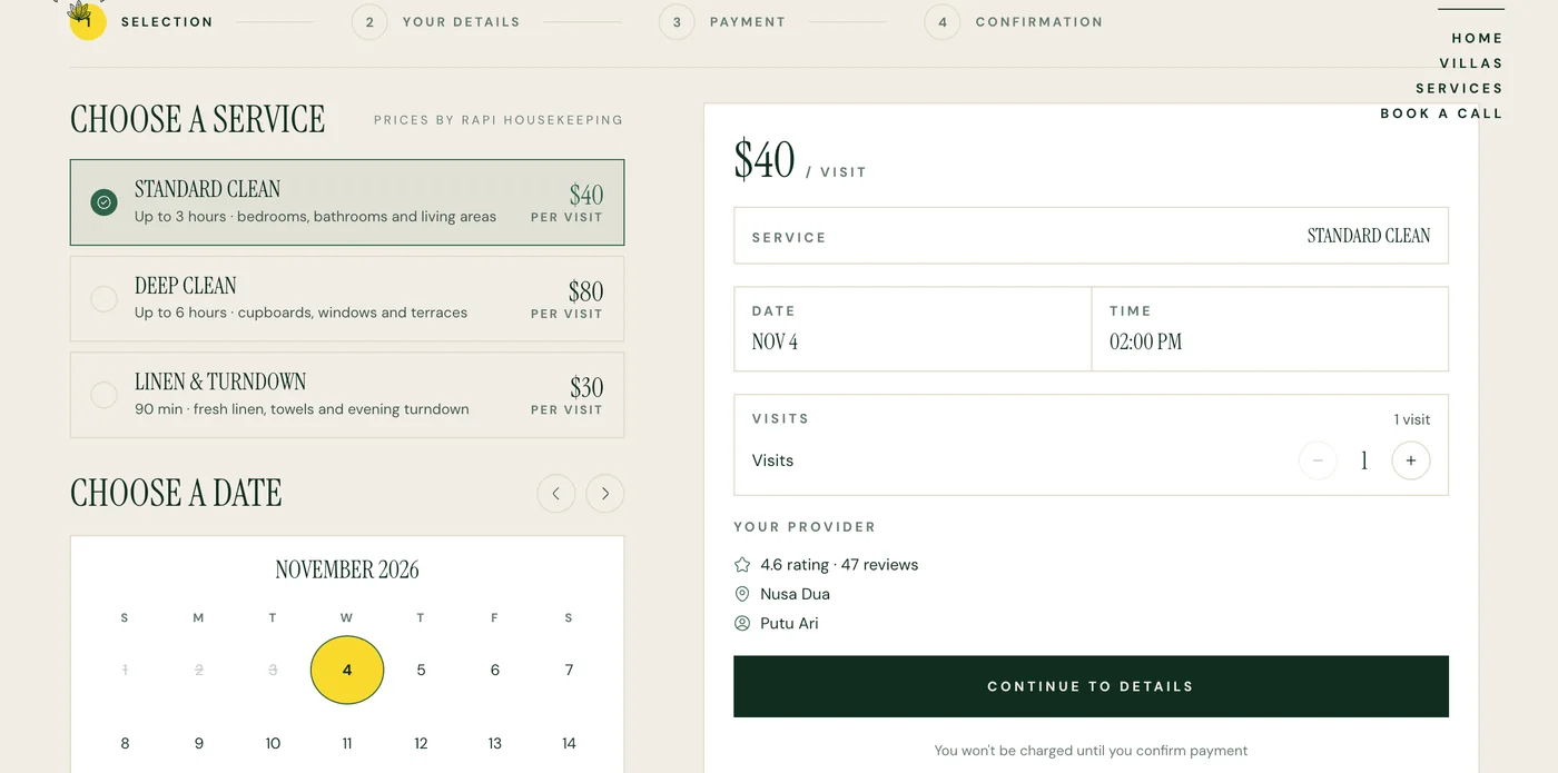
- step by step guide for users so that there won’t be any misleading user flow
- proper page for details so that people can understand and fill up without confusion.
Customers started saying yes
After the revamp, most were amazed by the new design, and there was a distinct rise in the successful booking rate. The product logic stayed the same, so we improved how MEB looked and felt without rebuilding it.
Most
targeted users liked the design
60%
agreed to proceed to next step.
20%
increased in user booking rate
